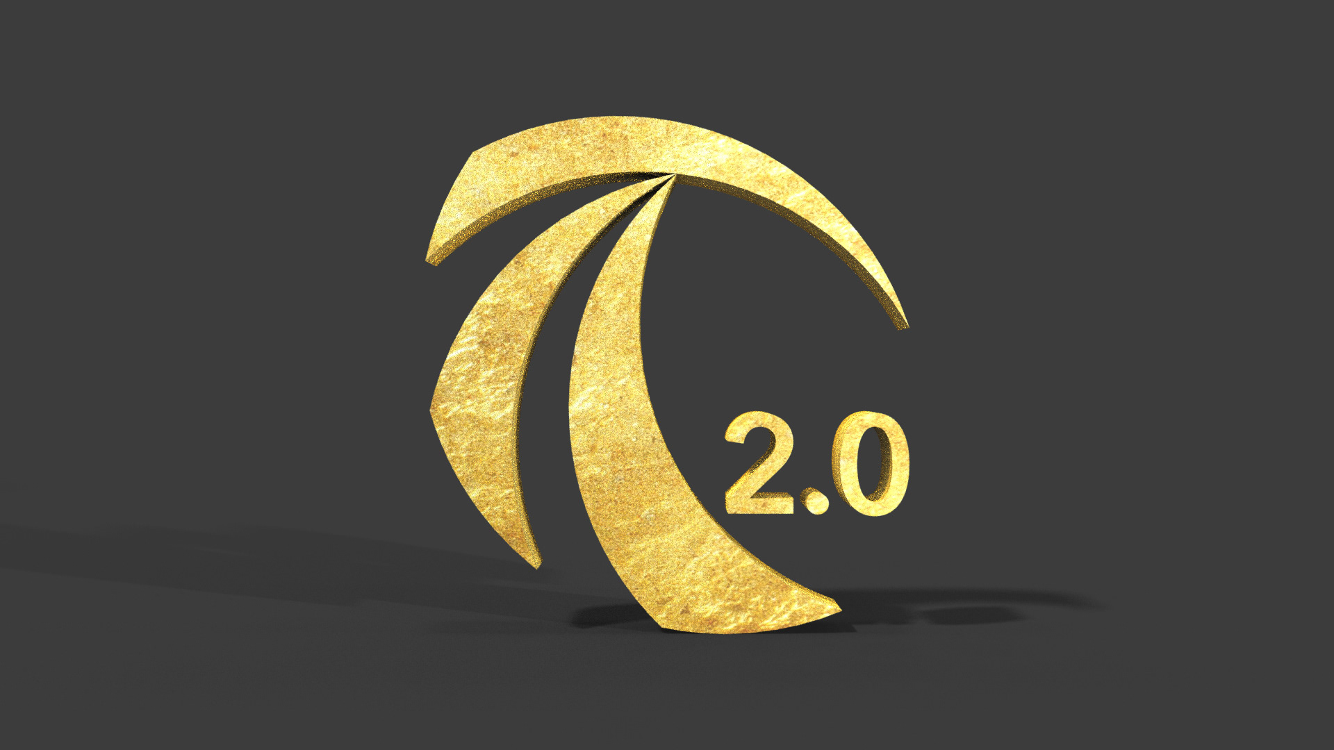

Logo Evolution: The original was more of a letter meant to represent the brand. My design created a balance to the letter "T," while also showing fluid lines that mimic "c" cuts a hockey player makes in the ice. So everything became within brand philosophy and a symbol to be recognized quickly on the ice or online.
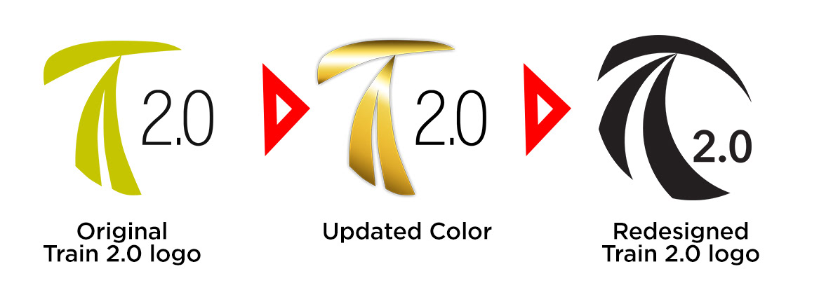
Logo redesign sheet for company vote.